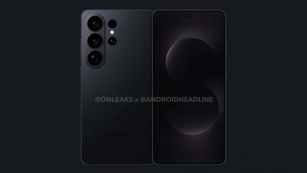
The Galaxy S26 Ultra appears poised to be another groundbreaking smartphone, boasting one of the most impressive and unique display features available to date.
Why the Now Bar Is a Frustration
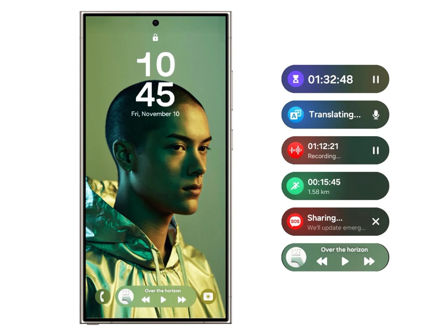
Most users encounter the Now Bar primarily through its media controls. Unfortunately, its pill-shaped design is cramped between app shortcuts, squeezed at the bottom of the screen, making it ergonomically difficult to use. The buttons are tiny — especially the “next track” control — and placed so low on the screen that tapping them accurately becomes a challenge.
The Now Bar Obstructs Rather Than Assists
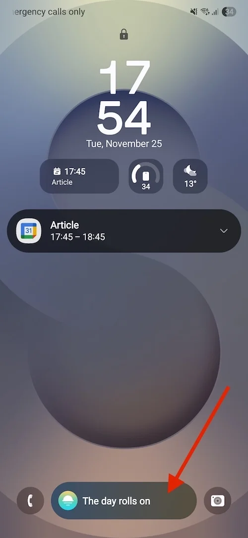
Samsung’s intent might have been to create a helpful, intelligent interface, but in practice, the Now Bar is more distracting than beneficial. Phrases like “The day rolls on” or “Wishing you well” come across as superficial rather than insightful or actionable.
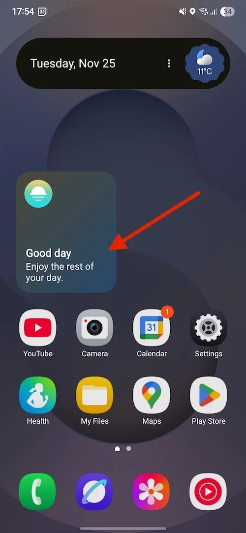
The Now Bar looks like a placeholder waiting for meaningful content that never fully materializes.
Samsung aimed for the Now Bar to be a smart, adaptive AI-driven experience, but it rarely learns user habits or customizes itself effectively. Instead, it often defaults to a repetitive, generic layout each day.
Community Voices: Widespread Frustration
The Samsung community forums are filled with user complaints about the Now Bar, with some of the top threads reading:
- "How do I fix/disable now bar?" — "The now bar is too small and uncomfortable. I prefer the older lock screen media player that was large and centered."
- "How do I remove the now bar from the lock screen?"
- "New update is AWFUL. How to get rid of the Now Bar..." — "Media controls are now smaller and at the bottom, with fewer options. No way to customize or move it. Anyone know how to get rid of it?"
A Half-Baked Feature That Compromises Functionality
While the Now Bar occasionally displays flight information or sports scores, is that convenience worth sacrificing smoother, more intuitive access to more commonly used features like media controls? I believe the answer is no.
Ultimately, the Now Bar feels like an unwelcome popup rather than a helpful assistant — a poorly executed feature that detracts from the overall user experience on Samsung’s flagship.