Google Introduces Updated Icons for Google Photos and Google Maps
Google has recently revealed new app icons for two of its popular apps - Google Photos and Google Maps. The new icons feature a gradient design, replacing the previous solid color sections, to reflect Google's commitment to AI-driven innovation and creativity.
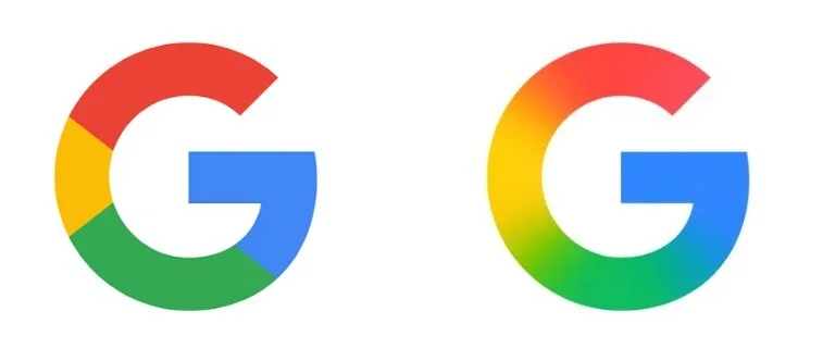
During the spring, Google announced its change to the icon for the Google app. | Image credit-9to5Google
Last week, Google made similar changes to the icons of Google Photos and Google Maps, enhancing the overall look and feel of the apps. The new icons showcase a more modern and sleek design, aligning with Google's branding aesthetic.
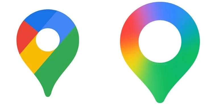
The old Google Maps icon on the left, and the new one coming soon. | Image credit-9to5Google
Google Photos' icon retains its original pinwheel shape but now features a gradient design within each blade, giving it a fresh and eye-catching look. The larger size of the new icon enhances visibility and branding.
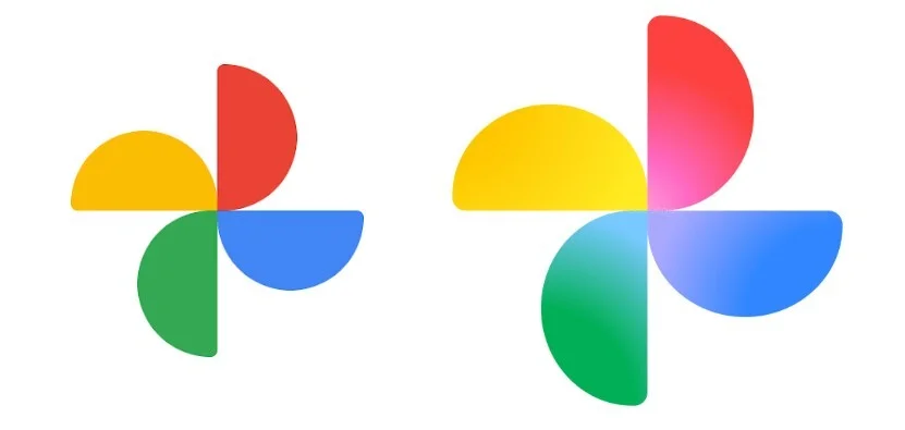
On the left, the old Google Photos icon with the updated icon on the right. | Image credit-9to5Google
Potential Changes for Other Google Apps
Google has hinted at potential icon updates for other apps like Play Store, Chrome, and Calendar, with the aim of creating a cohesive and visually appealing iconography across all its products.