Google has recently introduced a new look for Android Auto, incorporating its Material You interface into the music player. While some users appreciate the unified design that matches the phone's wallpaper, others are not on board with the changes.
Album Art Background Replaced with Wallpaper Color
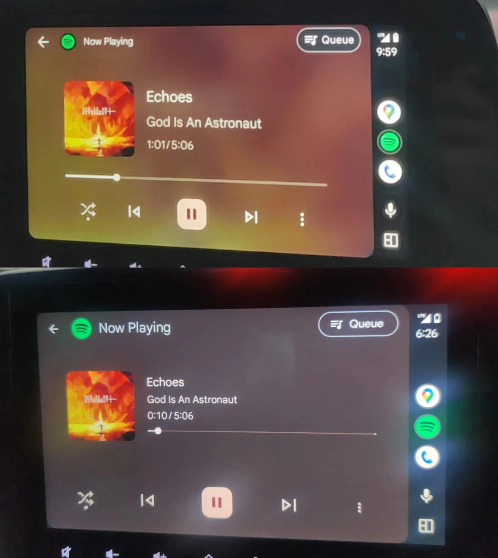
Top is before and bottom is after. | Image credit — @Adil15101
The music player now uses background colors from the Android wallpaper instead of dynamic album art backgrounds. While this change aims for consistency, some users find it to be a visual downgrade, missing the vibrant backgrounds tied to the music.
Android Auto music player redesign — upgrade or downgrade?
Votes 393
Back to Voting
Smaller Album Art and a Disjointed Layout
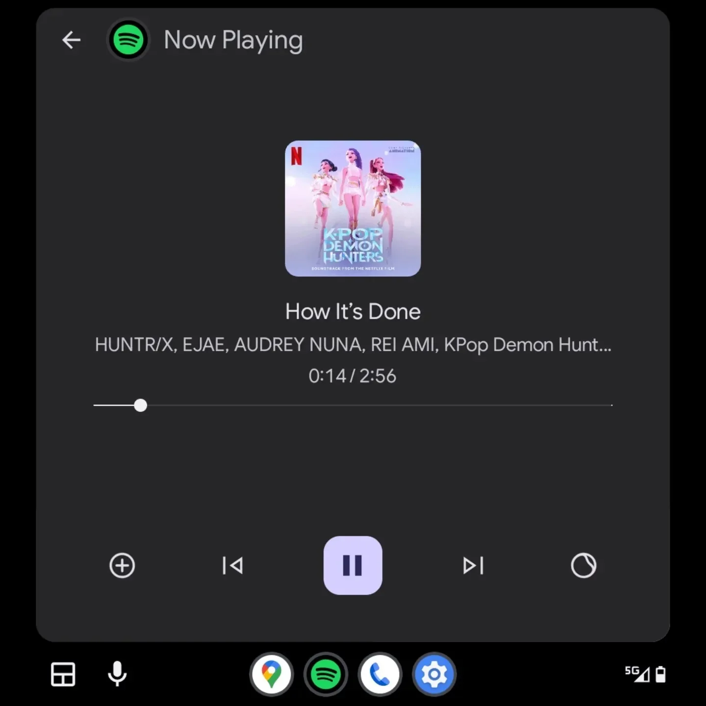
So much unused space... | Image credit — @flcinusa
The layout changes include a smaller album art size and repositioned seekbar, leading to a cluttered yet empty appearance on certain car displays. Users have expressed concerns about the imbalance created by these adjustments.
A Redesign Users Didn't Ask For
While Material You brings a fresh interface to Android Auto, some users feel that the update was not necessary. Google's plans for further enhancements indicate a shift towards modernization, including a light theme and new AI features.
