Are you a Pixel enthusiast who relies on the At a Glance widget for timely updates and information on your device? A recent beta release of Android 16 QPR1 has stirred up some debate among users regarding a small but significant change to the widget's color scheme. The usually colorful weather icon in the At a Glance widget has been replaced with a white icon, prompting mixed reactions from the Pixel community.
- Users have grown accustomed to the vibrant and color-coded icons in the widget, providing quick and easily recognizable information at a glance.
- The new monochromatic weather icon has divided opinions, with some praising the cleaner look while others lament the loss of visual cues.
- Suggestions have been made for Google to introduce a toggle option that allows users to customize the color scheme of the widget based on their preference.
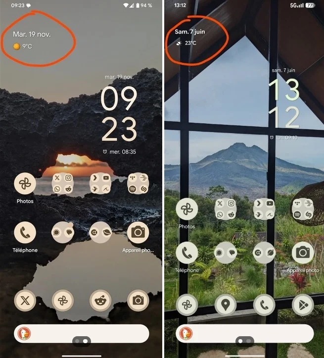
Comparison of the old colorful weather icon (left) and the new color-free weather icon (right) on the At a Glance widget.
Do you approve of the new color-free weather icon on the At a Glance widget?
Yes. The new look enhances the overall appearance of the widget.
30.77%
No. The color added valuable visual information that is now missing.
38.46%
I am indifferent to the presence or absence of color on the weather icon.
30.77%
Votes: 13
Back to Voting