Google is constantly innovating, and its latest changes to Google Maps are no exception. As part of their ongoing effort to enhance user experience, Google is testing a fresh approach to the pinning system in the Maps app. Instead of the current design, where pins become crowded as users zoom out, the new design opts for a simpler appearance. Pinned locations will reduce in size and lose their detailed icons, leaving behind only a colored dot encircled by a white border.
Though these new, smaller pins will no longer feature distinctive icons such as flags, hearts, and stars when zoomed out, they will retain their color. This will still allow users to easily identify the type of location pinned—be it a zoo, museum, restaurant, or gas station. It's important to note that pin icons will only change in appearance when the map is significantly zoomed out.
In August, Google briefly modified its pins but reverted to the original design after initial tests. The difference in the current testing phase is that some pins will remain unchanged while others will transition to the smaller, icon-less style. Although these reduced-size dots may be harder to spot, they create a more unobtrusive map, leading to a more aesthetically pleasing and less cluttered experience for Google Maps users.
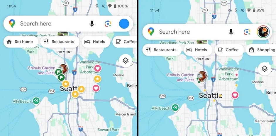
To the left, current Google Maps pins are displayed alongside the new, minimalist design being tested in the app's beta version (right). | Image credit-9to5Google
The updated pin design is currently available in Google Maps beta version 25.06.x. With more than two billion active monthly users, Google continually experiments with the app to elevate the navigation experience. These changes not only simplify the process of identifying pinned locations when zooming out but also contribute to a less crowded visual interface, enhancing overall user satisfaction.
While a specific date for the rollout of this new design to all Android users remains uncertain, users can anticipate ongoing enhancements to the Google Maps app in the near future.